New to Rust? Grab our free Rust for Beginners eBook Get it free →
How to Implement the Flutter Scaffold Class?

Every time you try to create a Flutter app, one thing you always encounter is the Scaffold class. Scaffold class is one of the most important topics in Flutter app development. So let’s deep dive into it.
Introduction to Flutter Scaffold
A Scaffold class is a foundational class in Flutter that provides us with several user interface-related widgets. For example App Bar, Floating Action Button, Drawer, Bottom Navigation Bar, etc. These are some of the most common UI components that you are going to use in every single project. These are written under the Scaffold class so we can use them inside it and customize them according to us.
In short, Scaffold provides us with ready-made UI components to customize and use in our app.
Implementing Scaffold Class
Let’s see the step-by-step guide on how we can use the Scaffold class in Flutter by creating a small project using the widgets it provides.
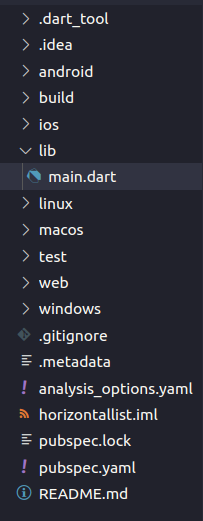
Folder Structure:
The project structure for this project is very simple. We are just going to remove all the code in the main.dart file generated by the pre-built flutter create command and write our own code from scratch to implement the Scaffold Class and the widgets it provides.
Setup Flutter App:
Create a simple Flutter application and replace the boilerplate code with the below code.
import 'package:flutter/material.dart';

void main() {
  runApp(const MyApp());
}

class MyApp extends StatelessWidget {
  const MyApp({super.key});

  @override
  Widget build(BuildContext context) {
    return MaterialApp(
      home: Scaffold(

      ),
    );
  }
}
Here we created a MaterialApp which is the main entry point of the Flutter application and in “home” we are returning “Scaffold”. There are several things that we can implement using Scaffold. Let’s start them one by one. First of all, we will go with the app bar.
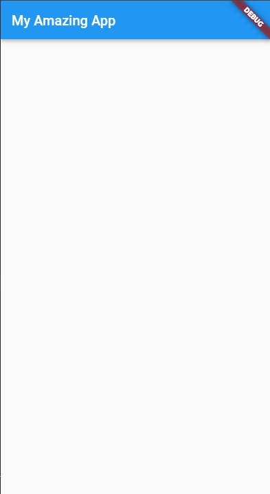
Creating AppBar:
Let’s add an AppBar inside Scaffold.
import 'package:flutter/material.dart';

void main() {
  runApp(const MyApp());
}

class MyApp extends StatelessWidget {
  const MyApp({super.key});

  @override
  Widget build(BuildContext context) {
    return MaterialApp(
      home: Scaffold(
        appBar: AppBar(title: const Text('My Amazing App')),
      ),
    );
  }
}
The code is very simple we are using the pre-built property “appBar” from Scaffold and adding a title with text to it.
Below is the output screenshot of our app if you rur the above code:
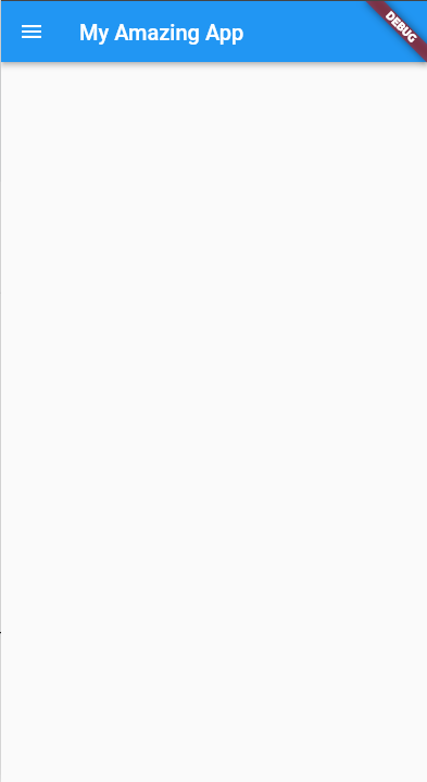
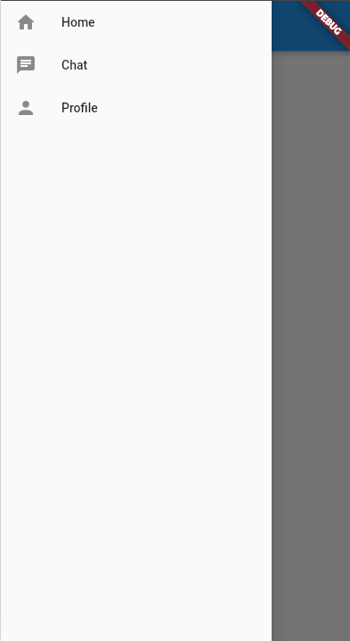
Creating Drawer:
The next thing that will add much more functionality and shining looks to our app is a drawer. In basic it is a sliding menu that opens whenever the user clicks or icon. It is usually used to navigate the user from one page to another as it contains navigation links. Let’s code it.
import 'package:flutter/material.dart';

void main() {
  runApp(const MyApp());
}

class MyApp extends StatelessWidget {
  const MyApp({super.key});

  @override
  Widget build(BuildContext context) {
    return MaterialApp(
      home: Scaffold(
        appBar: AppBar(title: const Text('My Amazing App')),
        drawer: Drawer(
          child: Column(
            children: const [
              ListTile(leading: Icon(Icons.home), title: Text('Home')),
              ListTile(leading: Icon(Icons.chat), title: Text('Chat')),
              ListTile(leading: Icon(Icons.person), title: Text('Profile')),
            ],
          ),
        ),
      ),
    );
  }
}
The first line of code is completely the same we are using a pre-built Drawer class. Then inside it, there is a “child” property that can contain any widget. So we are using a column inside it because we want several navigation links one upon another.
Inside that, we have a “children” property that can have multiple widgets inside it. It contains a special widget which is called ListTile which automatically makes a row that contains an icon in the beginning text in the middle and another icon in the ending.
The reason why we are using this will be clear to you once you see the output of the code:
Creating Floating Action Button:
Now we have a much better-looking app. Let’s add something more to it.
Whenever you open WhatsApp and you want to message someone that you haven’t the message then you use that small button which is displayed at the right bottom of the screen.
Have you ever wondered how we could make that same kind of thing in Flutter? What if we say this can be achieved with just one line of code?
import 'package:flutter/material.dart';

void main() {
  runApp(const MyApp());
}

class MyApp extends StatelessWidget {
  const MyApp({super.key});

  @override
  Widget build(BuildContext context) {
    return MaterialApp(
      home: Scaffold(
        appBar: AppBar(title: const Text('My Amazing App')),
        drawer: Drawer(
          child: Column(
            children: const [
              ListTile(leading: Icon(Icons.home), title: Text('Home')),
              ListTile(leading: Icon(Icons.chat), title: Text('Chat')),
              ListTile(leading: Icon(Icons.person), title: Text('Profile')),
            ],
          ),
        ),
        floatingActionButton: FloatingActionButton(onPressed: () {}, child: const Icon(Icons.add)),
      ),
    );
  }
}
Here we are using a pre-built UI function from the Scaffold class which is FloatingActionButton that makes a button for us and aligns it in the correct position where we want it to be aligned. You can also customize it more by exploring its other properties.
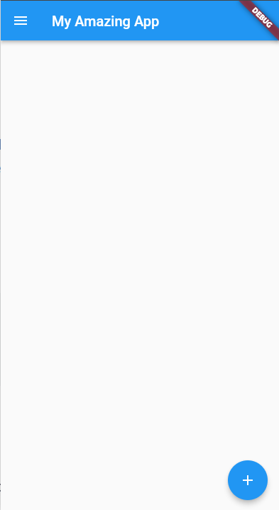
So that’s it! Our material design app is ready just by using the Scaffold class.
*What’s Next?
- Click here to learn how to create a Flutter Progress Bar
- Click here to learn how to create Alert Dialogs and Simple Dialogs in Flutter
Conclusion
In this tutorial, we have discussed the Scaffold class and implemented the basic three widgets it provides. But this is not the end of the list, there are still many more scaffold widgets that you can explore to create the visual layout structure of your app. We hope you enjoyed reading this tutorial and stay tuned for more advanced tutorials on Flutter.
Reference
https://api.flutter.dev/flutter/material/Scaffold-class.html