New to Rust? Grab our free Rust for Beginners eBook Get it free →
Flutter Progress Bar: LinearProgressIndicator & CircularProgressIndicator
Whenever you are creating an application a stage comes when you need the user to wait until the application or data is loaded. At that time we use progress indicators.
In this tutorial, we learn to create a progress bar using LinearProgressIndicator and CircularProgressIndicator widgets. So let’s dive into some theory and code.
Need of Progress Bar In Flutter
Flutter Progress Bar plays an important role in user experience. Suppose a user opens Instagram and it will take some time to load posts. What if the screen became blank until the posts were loaded? Will it be a good User experience? We guess not. Instead what happens is until the data is loaded a circular or linear progress indicator is shown to the user. These are the signs that tell the user that he or she needs to wait for the continuation of the execution of the application.
Also Read: Flutter State Management: setState
Creating Progress Bar In Flutter
In Flutter, we can create two types of progress bars: circular and linear. Let’s see the step-by-step process to make these.
Project Structure
The project structure for this project is very simple. We are just going to remove all the code in the main.dart file generated by the pre-built flutter command and write our own code from scratch to create Progress Bar.
Circular Progress Bar In Flutter
A circular progress bar is a circular bar that keeps rotating until the data is loaded. The simplest example of this type of progress indicator is when we open someone’s Whatsapp Status and it takes some time to load. At that time we can easily see a circular progress indicator.
Create a simple Flutter application and replace the boilerplate code with the below code. It is just a basic Flutter stateless widget that has a material app widget inside it.
import 'package:flutter/material.dart';

void main() {
  runApp(const MyApp());
}

class MyApp extends StatelessWidget {
  const MyApp({super.key});

  @override
  Widget build(BuildContext context) {
    return const MaterialApp(

    );
  }
}
Inside it, we will return Scaffold so that we can have access to the body attribute and start designing the body of our application.
home: Scaffold(
        body: Center(),
),
The next task is to add a CircularProgressIndicator widget to the centre of the body. Also, we will assign some of the options to change its color and width. You can align it anywhere but for simplicity, we will choose to align it in the center.
        body: Center(
          child: CircularProgressIndicator(
            color: Colors.blue,
            strokeWidth: 7,
          ),
        ),
The complete code is given below which you can directly use to create a circular progress bar in Flutter. But you can always play around with the given properties of a widget in a Flutter by clicking “CTRL + Space Bar” which will show you all the available options that can be used. So make sure to check them out.
Code for Creating Circular Progress Bar in Flutter
import 'package:flutter/material.dart';

void main() {
  runApp(const MyApp());
}

class MyApp extends StatelessWidget {
  const MyApp({super.key});

  @override
  Widget build(BuildContext context) {
    return const MaterialApp(
      home: Scaffold(
        body: Center(
          child: CircularProgressIndicator(
            color: Colors.blue,
            strokeWidth: 7,
          ),
        ),
      ),
    );
  }
}
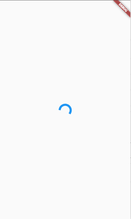
With just these few lines we can achieve a fully working circular progress bar. Below we have shown you the output.
Output
Linear Progress Bar in Flutter
What if we say that we just need to change a single word in the above code to achieve a fully working linear progress bar?
We just need to change the “CircularProgressIndicator” widget to the “LinearProgressIndicator” widget and that’s it there is nothing more to do. Let’s try it out.
Code for Creating Linear Progress Bar in Flutter
import 'package:flutter/material.dart';

void main() {
  runApp(const MyApp());
}

class MyApp extends StatelessWidget {
  const MyApp({super.key});

  @override
  Widget build(BuildContext context) {
    return const MaterialApp(
      home: Scaffold(
        body: Center(
          child: LinearProgressIndicator(
            color: Colors.blue,
          ),
        ),
      ),
    );
  }
}
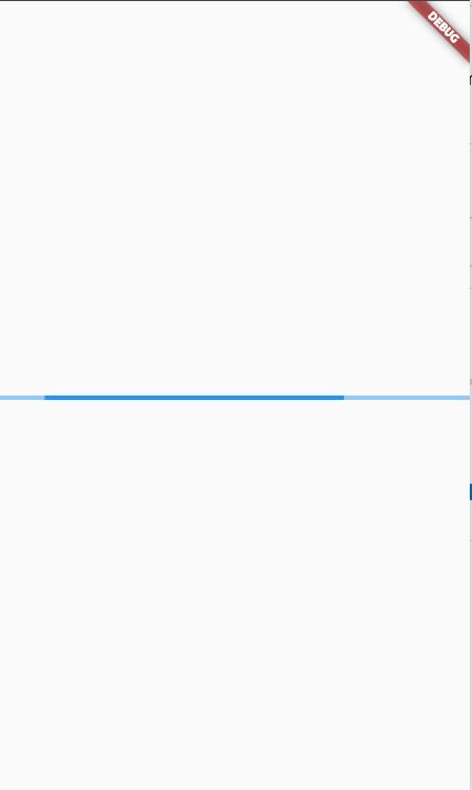
Output
Also Read: Dialog Box in Flutter
Summary
So we hope this post proved helpful to you and you must have gained some knowledge after spending a few minutes here. That’s not all you can do with progress indicators, there’s a lot more you do with them with advanced topics. We would also prefer that you use state management and progress indicators combined. You can also use some progress indicator packages that you can find online. The main advantage of those packages is that they will give you a better-looking progress indicator.
References
https://api.flutter.dev/flutter/material/CircularProgressIndicator-class.html
https://api.flutter.dev/flutter/material/LinearProgressIndicator-class.html