
New to Rust? Grab our free Rust for Beginners eBook Get it free →
Flutter Drawer – A Step-by-Step Guide

As a navigation menu grows, its rows may need more room than the screen provides. A Flutter drawer is a panel that slides in from the edge of a Scaffold and holds navigation choices.
I’ll show how to make the menu scroll and update the visible page when someone selects a destination.
What a Flutter drawer does
A Flutter drawer is a Material panel that slides in from the edge of a Scaffold to hold navigation choices. Set the Scaffold’s drawer property, and its AppBar supplies a menu button while Scaffold handles the edge-swipe gesture.
The drawer is temporary navigation, not the page itself. Your app still owns which destination is selected and what content appears after a tap.
| Widget | Job in this example |
|---|---|
| Scaffold | Owns the drawer and page layout |
| Drawer | Provides the side panel |
| ListView | Lets the menu scroll when it is taller than the screen |
| ListTile | Displays a destination and responds to a tap |
Prerequisites for the example
- Use a Flutter project with the Flutter SDK installed.
- Configure a device or emulator before launching the app.
- Replace the starter code in lib/main.dart with the complete example below.
Step 1: Attach the drawer to Scaffold
Start with the page and its drawer together. Keeping the selected destination in the page state means a menu tap can update the visible content before the drawer closes.
import 'package:flutter/material.dart';

void main() {
  runApp(const DrawerDemoApp());
}

class DrawerDemoApp extends StatelessWidget {
  const DrawerDemoApp({super.key});

  @override
  Widget build(BuildContext context) {
    return MaterialApp(
      title: 'Drawer demo',
      theme: ThemeData(useMaterial3: true),
      home: const HomePage(),
    );
  }
}

class HomePage extends StatefulWidget {
  const HomePage({super.key});

  @override
  State<HomePage> createState() => _HomePageState();
}

class _HomePageState extends State<HomePage> {
  int _selectedIndex = 0;

  static const _destinations = <String>[
    'Home',
    'Projects',
    'Settings',
  ];

  void _selectDestination(int index) {
    setState(() {
      _selectedIndex = index;
    });
    Navigator.pop(context);
  }

  @override
  Widget build(BuildContext context) {
    return Scaffold(
      appBar: AppBar(title: const Text('Drawer demo')),
      drawer: Drawer(
        child: ListView(
          padding: EdgeInsets.zero,
          children: [
            const DrawerHeader(
              decoration: BoxDecoration(color: Colors.indigo),
              child: Align(
                alignment: Alignment.bottomLeft,
                child: Text(
                  'Workspace',
                  style: TextStyle(color: Colors.white, fontSize: 24),
                ),
              ),
            ),
            for (var index = 0; index < _destinations.length; index++)
              ListTile(
                leading: Icon(_iconFor(index)),
                title: Text(_destinations[index]),
                selected: index == _selectedIndex,
                onTap: () => _selectDestination(index),
              ),
          ],
        ),
      ),
      body: Center(
        child: Text('Selected page: ${_destinations[_selectedIndex]}'),
      ),
    );
  }

  IconData _iconFor(int index) {
    switch (index) {
      case 0:
        return Icons.home;
      case 1:
        return Icons.folder;
      default:
        return Icons.settings;
    }
  }
}
Step 2: Build a menu that can scroll
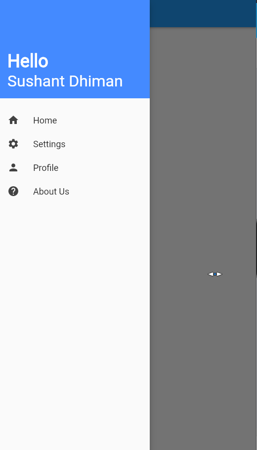
ListView lets the menu scroll when its items are taller than the available screen. EdgeInsets.zero removes its default inset, and DrawerHeader gives the destinations a clear starting point.
The screenshot shows the open state, with a header and menu rows above the dimmed page.
Step 3: Select a destination and close the drawer
A ListTile can show a selected state, but the app must track which destination is active. Here, _selectedIndex stores that choice, and the selected property reads it.
| Action | Effect |
|---|---|
| Set _selectedIndex in setState | The page rebuilds with the chosen destination active |
| Call Navigator.pop(context) | The drawer closes |
Verify the navigation flow
Run the app on a configured device or emulator, open the AppBar menu button, and choose each destination. The drawer should close after a choice, the page label should match it, and reopening the drawer should highlight the same choice.
- Open the AppBar menu button and confirm Home is selected.
- Tap Projects and confirm the page label and selected row change.
- Reopen the drawer and confirm the selection remains highlighted.
Handle menu overflow and Material 3 choices
When destinations no longer fit vertically, a fixed Column can overflow, so use ListView to make the drawer scroll. NavigationDrawer offers indexed destination selection for Material 3 apps.
| Widget | Use it for |
|---|---|
| Drawer | A temporary panel with custom content or simple menu rows |
| NavigationDrawer | A Material 3 component with indexed destination selection |
Keep navigation state with the page
If the selected destination must outlive this page, connect the menu to the app’s routing layer instead of keeping the index only in this widget. Run the sample from its project directory:
flutter run
Flutter drawer questions
How does a Flutter drawer open?
When a Drawer is assigned to Scaffold.drawer, the AppBar normally displays a button that opens it. Scaffold also handles the edge-swipe gesture unless that behavior is disabled.
How do I close a Flutter drawer after a menu tap?
Call Navigator.pop(context) from the ListTile callback after applying the selected destination. ScaffoldState.closeDrawer is another documented close method.
How can a Flutter drawer menu scroll?
Use a ListView as the Drawer child. It can scroll when its content is taller than the available screen height.
Should I use Drawer or NavigationDrawer?
Drawer is a side panel commonly used with Scaffold. Flutter documents NavigationDrawer as a Material 3 destination-oriented alternative with indexed selection callbacks.