
New to Rust? Grab our free Rust for Beginners eBook Get it free →
Plotting Multiple Datasets on a Scatterplot Using Matplotlib
Matplotlib is a well-used tool by many developers when it comes to data visualization using graphical plots. It can also be used to generate plots for datasets created using Python libraries such as NumPy and Pandas. However, when it comes to plotting multiple datasets, a scatterplot is the way to go. A scatterplot helps us understand and visualize the relationship between variables in different datasets provided. In this article, we’ll understand the procedure for plotting multiple datasets on a scatterplot with some examples starting from a single dataset to multiple datasets.
How to Install and Use Matplotlib?
Before we can move on to using scatterplots or plotting multiple datasets, it is important to have Matplotlib installed. This can be done using the below command.
Installation Syntax:
pip install matplotlib
Once we have installed it on our system we can import it using import statements into our file as shown below.
Import Syntax:
import matplotlib.pyplot as plt
Now, we are all set to start working with some datasets.
Plotting Single Dataset on Scatterplot
Before we can start plotting multiple datasets, we would have to know how to plot a single dataset on a scatterplot. So we will need a dataset containing various x and y values to plot. We can create one of our own or generate a random dataset using the rand() function provided by NumPy.
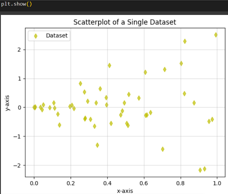
Let’s look at an example where we’ll generate both the x and y values of our dataset using rand(). We will generate 50 different values for both x and y. To plot a scatterplot we use the scatter() function from Matplotlib which we will understand below in detail.
Example:
import matplotlib.pyplot as plt
import numpy as np

dataset_x = np.random.rand(50)
dataset_y = 2 * dataset_x * np.random.randn(50)

plt.scatter(dataset_x, dataset_y, label='Dataset', color='y', marker='d', alpha=0.7)

plt.xlabel('x-axis')
plt.ylabel('y-axis')
plt.title('Scatterplot of a Single Dataset')

plt.legend()
plt.grid(True, linestyle='-', alpha=0.5)
plt.show()
Here, we first import matplotlib and numpy as plt and np respectively, for easier usage. Then we create our dataset, where dataset_x representing the x coordinates of our dataset is generated using the rand() function from the random module of the numpy library. rand(50) indicates that we are generating 50 coordinates. Similarly, dataset_y represents the y coordinates, which are generated by multiplying 2 to the corresponding random coordinates in dataset_x.
Now that we have our dataset, we can plot it using the scatter() function. Let us understand scatter() in detail.
Matplotlib scatter() Function Syntax:
matplotlib.pyplot.scatter(x, y, s=None, c=None, marker=None, cmap=None, alpha=None, linewidths=None, edgecolors=None)
- x and y: Required parameters indicating the data that contains the x and y coordinates to be plotted. Keep in mind the length (number of data elements) of x and y must be the same.
- s: used to set the size of the marker used.
- c: used to set the colour of the marker used. Commonly used colours are (‘b’ – blue, ‘r’ – red, ‘g’ – green and ‘y’ – yellow).
- cmap: sets colourmap, which maps data to colours. Used in more complex data visualizations such as Gaussian Kernel Matrix.
- alpha: Used to set the opacity of the marker used. Has a value between 0 (transparent) to 1 (opaque).
- linewidths: used to set the width of the marker border.
- edgecolors: used to set color of the marker borders.
The scatter() function in our example takes the arguments dataset_x containing 50 randomly generated x coordinates and dataset_y which is twice the coordinates generated by dataset_x. We give it a label Dataset, which will be displayed when we use a legend. To style the plot, we have set marker=’d’ where d represents a diamond-shaped marker, we set it color=’y’ where y indicates that the colour of the marker will be yellow and we set alpha=0.7 which indicates the opacity of the marker is 70%.
We have then customized the way our plot looks and what information is displayed on the plot. plt.xlabel() and plt.ylabel() are used to set the labels given for the x and y axes of the graph. plt.title() is used to set the title of the whole plot. plt.legend() sets a legend containing all the markers and their corresponding labels we have used in the plot.
The plt.grid() is used to set a grid on the plot. In this example, it takes in 3 parameters:
- True: indicates that a grid should be present on the plot.
- linestyle: used to indicate what style of lines the grid should have. linestyle=’-‘ indicates normal lines, linestyle=’–‘ indicates dashed lines on the grid and so on.
- alpha: used to indicate the opacity of the grid. alpha=’0.5′ indicates 50% opaque grid.
Finally, plt.show() is used to display the plot.
Output:
Plotting Multiple Datasets on Scatterplot
Now that we have understood how to plot a single dataset we can follow a similar procedure to plot multiple datasets on a scatterplot.
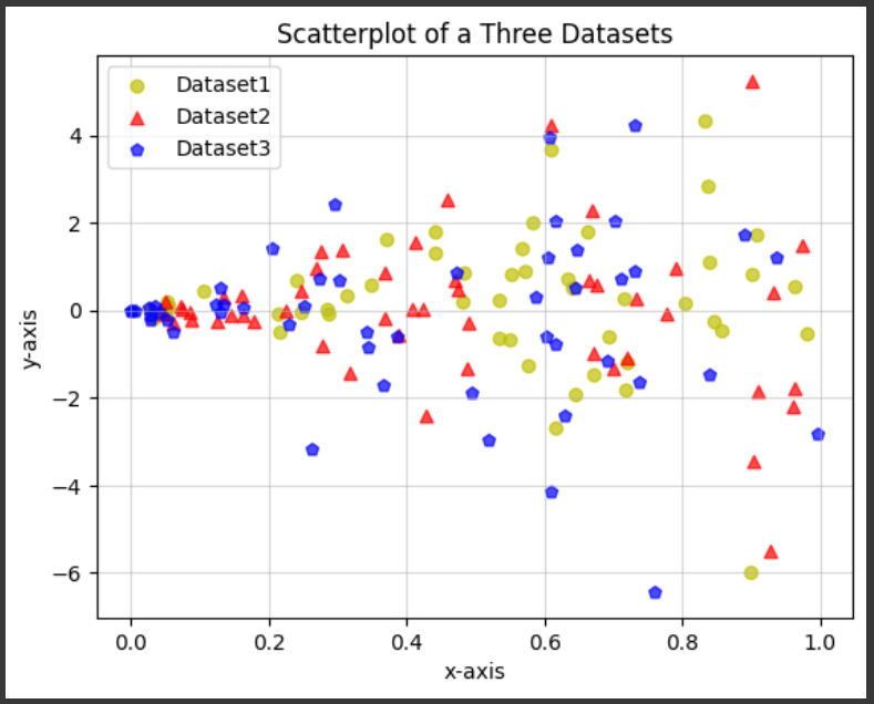
Let’s understand an example where we’ll create three datasets of our own, each containing both x and y coordinates. Similar to how we generated 50 random values for both x and y coordinates for a single dataset, we’ll do the same for all 3 datasets. This is done using the rand() function in NumPy.
Example:
import matplotlib.pyplot as plt
import numpy as np

dataset1_x = np.random.rand(50)
dataset1_y = 2 * dataset1_x * np.random.randn(50)

dataset2_x = np.random.rand(50)
dataset2_y = 3 * dataset2_x * np.random.randn(50)

dataset3_x = np.random.rand(50)
dataset3_y = 4 * dataset3_x * np.random.randn(50)

plt.scatter(dataset1_x, dataset1_y, label='Dataset1', color='y', marker='o', alpha=0.7)
plt.scatter(dataset2_x, dataset2_y, label='Dataset2', color='r', marker='^', alpha=0.7)
plt.scatter(dataset3_x, dataset3_y, label='Dataset3', color='b', marker='p', alpha=0.7)

plt.xlabel('x-axis')
plt.ylabel('y-axis')
plt.title('Scatterplot of a Three Datasets')

plt.legend()
plt.grid(True, linestyle='-', alpha=0.5)
plt.show()
In the code above, we have first imported matplotlib and numpy. Then we created our 3 datasets that we’re going to plot and generated 50 random points for each x and y values of those datasets. Then we use the plt.scatter() function to plot these datasets on a scatterplot. Plotting all of the datasets on the same scatterplot helps us better visualize the relationship between them.
To distinguish between the datasets easily, we have given our own customisations to each of the dataset plots, by setting the color and marker parameters on each of them. For the colours, we have used ‘y’, ‘r’ and ‘b’ which stand for yellow, red and blue respectively. As for the markers, we have used ‘o’, ‘^’ and ‘p’ which indicate circle, triangle and pentagon-shaped markers respectively.
Further to customize the way our plot looks, we have first used xlabel() and ylabel() functions to label the x and y axes of the plot, title() to give a title of what the plot represents, legend() to display which dataset is represented by what marker in the plot and grid() to set a background grid of 50% opacity to the plot.
Finally, we display the plot using plt.show().
Output:
Conclusion
Creating scatterplots can be a great way of visualizing multiple datasets and how they relate to each other. We have seen in this article, that Matplotlib provides an easy way to create scatterplots using the scatter() function. By analyzing how we can plot a single dataset, we have understood that by following the same procedure we can generate plots for multiple datasets. With some examples (containing some pretty graphs!), we have learned how to customize our scatterplot however we see fit. These skills can prove to be essential in fields dealing with data visualization.
Reference
https://stackoverflow.com/questions/4270301/multiple-datasets-on-the-same-scatter-plot