New to Rust? Grab our free Rust for Beginners eBook Get it free →
Flutter Widgets: Text, Button, Row & Column
Widgets are the most basic part of a Flutter application. A widget is a predefined set of code that will give you user interface-based output. For example, when you are creating a button in Flutter, you are creating a widget that displays a button on the screen. Hence complex app user interface is nothing but a combination of widgets.
In this tutorial, we will discuss some of the most basic widgets so that you can have a getting-started push. So let’s dive into interesting content.
Also Read: Flutter App Bar: A Step-by-Step Guide
Flutter Text Widget
As its name suggests it is just a simple widget that will show some text on a screen. Its code is very simple you just need to add Text() to your code. To give the style you can add style: TextStyle() argument. The text widget is the backbone of the Flutter app as it is used everywhere. You will use Text inside buttons, inside cards, inside the app bar, and everywhere.
Code:
import 'package:flutter/material.dart';

void main() {
  runApp(const MyApp());
}

class MyApp extends StatelessWidget {
  const MyApp({super.key});

  @override
  Widget build(BuildContext context) {
    return const MaterialApp(
      home: Scaffold(body: Text('Hello World')),
    );
  }
}
Explanation:
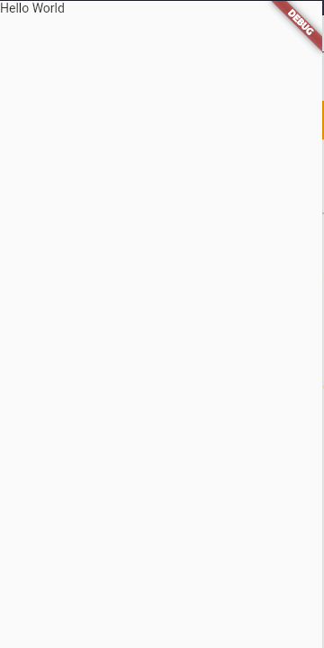
Inside the body, we simply created a Text widget and the first argument that we need to pass is the text content itself in the form of a string. Anything that you pass as a string in the Text widget will be displayed as it is on the screen.
Output:
Most of the time we also need to give style to our text. For that, we have an inbuilt property of the Text widget that is style. We can use style to customize our text.
Code:
import 'package:flutter/material.dart';

void main() {
  runApp(const MyApp());
}

class MyApp extends StatelessWidget {
  const MyApp({super.key});

  @override
  Widget build(BuildContext context) {
    return const MaterialApp(
      home: Scaffold(
        body: Text(
          'Hello World',
          style: TextStyle(
              color: Colors.blue, fontSize: 48, fontWeight: FontWeight.bold),
        ),
      ),
    );
  }
}
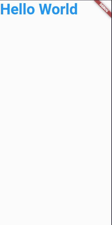
In the Text Style argument, we can easily pass color, font size as well as font weight.
Flutter Button Widget
Buttons are one of the most common elements in any Android application no matter how small or how big the application is you will always see some kind of buttons in it.
There is a class of ElevatedButton that you can use to display buttons on your screen.
Code:
import 'package:flutter/material.dart';

void main() {
  runApp(const MyApp());
}

class MyApp extends StatelessWidget {
  const MyApp({super.key});

  @override
  Widget build(BuildContext context) {
    return MaterialApp(
      home: Scaffold(
        body: ElevatedButton(onPressed: (){}, child: const Text('Click Me'))
      ),
    );
  }
}
Explanation:
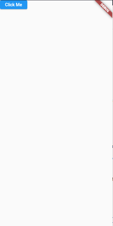
At first, we created an instance of ElevatedButton after that it require arguments. The first argument is a function which is called onPressed, it will accept a function and the code written inside it will be executed once the button is clicked. The next argument is a child which specifies what should be displayed inside the button. In our example, we just displayed the text “Click Me”.
Output:
Most of the time you need to show your widgets either in a row-major order or in column-major order. For that, we have some layout-based widgets which specify the positioning of other widgets.
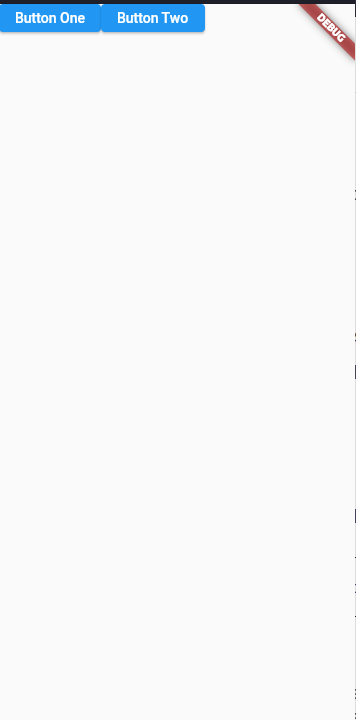
Flutter Row Widget
The row widget aligns its children widgets in a horizontal layout.
Code:
import 'package:flutter/material.dart';

void main() {
  runApp(const MyApp());
}

class MyApp extends StatelessWidget {
  const MyApp({super.key});

  @override
  Widget build(BuildContext context) {
    return MaterialApp(
      home: Scaffold(
        body: Row(
          children: [
            ElevatedButton(onPressed: (){}, child: const Text('Button One')),
            ElevatedButton(onPressed: (){}, child: const Text('Button Two')),
          ],
        )
      ),
    );
  }
}
Explanation:
At the top of all the widgets, we created a row widget. Inside that row widget, we have a children argument that can have an infinite number of widgets.
Then we did is wrote code for 2 elevated buttons. Then they are automatically aligned horizontally because of the parent row widget.
Output:
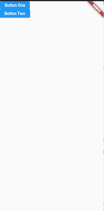
Flutter Column Widget
The only difference between the row and column widgets is of alignment of its children widgets. If we just replace Row with Column then output is enough to describe what is happening around.
Code:
import 'package:flutter/material.dart';

void main() {
  runApp(const MyApp());
}

class MyApp extends StatelessWidget {
  const MyApp({super.key});

  @override
  Widget build(BuildContext context) {
    return MaterialApp(
      home: Scaffold(
        body: Column(
          children: [
            ElevatedButton(onPressed: (){}, child: const Text('Button One')),
            ElevatedButton(onPressed: (){}, child: const Text('Button Two')),
          ],
        )
      ),
    );
  }
}
Output:
Summary
In this post, we have discussed the most basic widgets in Flutter. These are the building blocks of any Flutter application. We have discussed Text, Buttons, Rows, and Columns. You can now make some basic projects and apps for your learning with the knowledge that you gained in this tutorial.
Reference
https://docs.flutter.dev/development/ui/widgets