New to Rust? Grab our free Rust for Beginners eBook Get it free →
Flutter App Bar: A Step-by-Step Guide

Welcome coders to this one more exciting tutorial of Flutter. In this blog post, we are going to learn about Flutter AppBar, not only theory but we are also going to implement our own App Bar. After this post, you can easily design and develop any type of app bar using Flutter. So let’s dive into interesting content.
Also Read: Dart Getting Started Guide 2023
What is an App Bar?
An App Bar is the topmost section of any mobile application or website. This section usually deals with the navigation and logo of the product. Some other stuff such as notification icons can also be found in a professional app bar.
As our post is mainly focused on Flutter, we are going to discuss mobile application-based app bars. The only difference between mobile and website app bars is that website app bars are wider and can contain more data as compared to the mobile app bar.
Components of an App Bar
The Flutter app bar mainly consists of three components.
- Leading: – It is the leftmost part of the app bar. It is mainly used for making drawers that can be used for navigation. A drawer is just a 1/3 wider screen area that slides out and shows us some navigation links. You can fully customize it.
- Title: – As its name suggests it can be a logo, name, or any image that describes your product.
- Actions: – It is a group of elements (mainly icons) that can be used to add more accessibility to the App Bar. For example actions in the app bar may contact Notification Icon and Menu icon which will lead to different functionality.
Properties of an App Bar
- elevation: – It is the numeric value that describes the about of the bottom shadow of the app bar. Sometimes we want our app bar to pop out from the main content then we can use the elevation property for it.
- backgroundColor: – Coloring is the most important thing in designing and hence app bar provides you backgroundColor option that can be used to configure its background colour.
- shape: – You can also play with the app bar shape with this property.
Creating a Basic Flutter App Bar
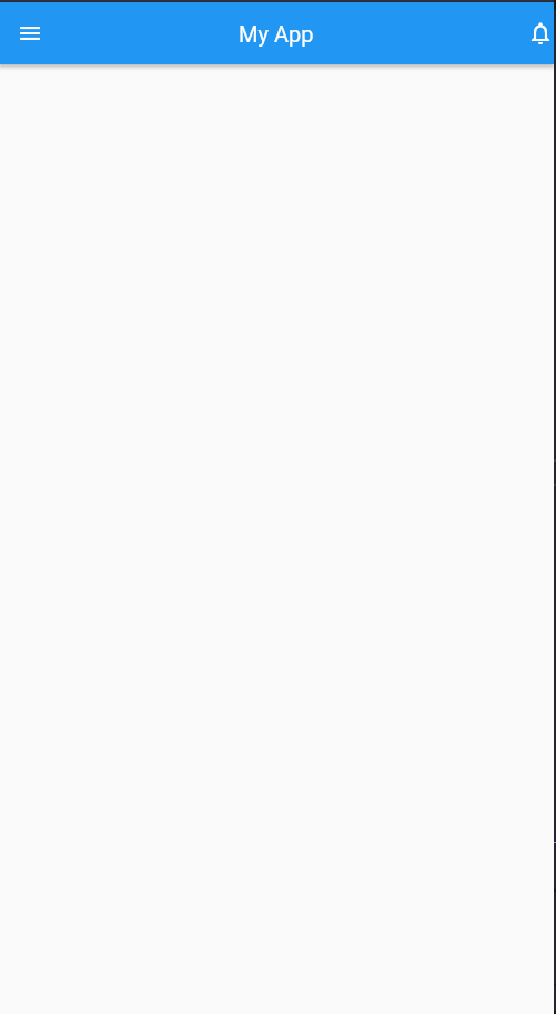
App Bar:
Code:
import 'package:flutter/material.dart';

void main() {
  runApp(const MyApp());
}

class MyApp extends StatelessWidget {
  const MyApp({super.key});

  @override
  Widget build(BuildContext context) {
    return MaterialApp(
      debugShowCheckedModeBanner: false,
      home: Scaffold(
        appBar: AppBar(
          title: const Text('My App'),
          centerTitle: true,
          leading: const Icon(Icons.menu),
          actions: const [
            Icon(Icons.notifications_outlined)
          ],
        ),
      ),
    );
  }
}
Explanation:
- In the following code, we created a typical Flutter application and in Scaffold, we passed the appBar argument as key and we passed an instance of AppBar class as value to that key. This is the initial step of creating an app bar and we are ready to add elements and power it up.
- Then we added a title argument and this argument accepts a Text widget. We can also use all the properties of the Text widget here. You can simply write your app name in it and add styles to it.
- Next in order to make things separate from each other and maintain the readability of the app we can pass the argument with the value of true to bring the title to the centre.
- In most of the app top left part is a menu icon with which the user can navigate. We used the leading property and passed an icon to it to achieve the same design as most apps.
- Just like we added an icon to the top left corner we can also add an icon to the top right corner. This section is usually used for the notification section. Hence we will also display a notification icon here.
- The whole procedure of displaying the notification icon is the same. The only difference is that instead of leading we have to use actions and pass a list using [] operators. Because we can pass multiple icons in the actions section.
Summary
So we hope that this post was educational for you and you found this content interesting. In this post, we tried to provide you with both theoretical as well as practical knowledge of app bars. That’s why we first discussed some of the theory parts and then moved forward to code implementation. In between, we also told you which section of the app bar is used for which icon. Now after this basic knowledge, you can play with app bar properties and make your beautiful and eye-catching app bars. Thank You and have a nice day.
References