
New to Rust? Grab our free Rust for Beginners eBook Get it free →
Data Visualization with Streamlit in Python
Data visualization is very essential these days and with Streamlit it becomes easy to achieve! We have already discussed the basics of Streamlit in ‘A Beginner’s Guide to Streamlit in Python‘. Now, in this article, let’s explore the ways of data visualization in Streamlit. We will see how to implement graphs and maps, so let’s begin.
Need for Visualization
Data visualization helps us understand data better by making it into pictures, showing us patterns and important points. But just making a pretty picture isn’t enough. We need to make sure the picture tells the right story and isn’t too confusing.
Imagine someone gives you a huge table with a million pieces of information and asks you to find something important in it. That would be really hard! But if we turn that table into a graph or map, it’s much easier to see what’s going on.
That’s where Streamlit comes in handy. It helps us turn boring data into interesting pictures that tell us what we need to know.
Visualizing Data in Python Using Charts
Streamlit supports several different charting libraries. It has many methods for representing data in the form of charts and graphs. Some of the most useful forms are discussed below.
1. Area Chart
An area chart shows how values change over time or categories by filling in the area below the line. To display an area chat we use st.area_chart().
Example:
import streamlit as st
import pandas as pd

# Sample data for Milk
data_milk = {
    'Days': ['Day 1', 'Day 2', 'Day 3', 'Day 4', 'Day 5'],
    'Milk': [24, 10, 6, 70, 42]
}

# Sample data for Curd
data_curd = {
    'Days': ['Day 1', 'Day 2', 'Day 3', 'Day 4', 'Day 5'],
    'Curd': [20, 60, 16, 7, 12]
}

# Sample data for Butter
data_butter = {
    'Days': ['Day 1', 'Day 2', 'Day 3', 'Day 4', 'Day 5'],
    'Butter': [5, 20, 56, 34, 23]
}

# Create DataFrames
df_milk = pd.DataFrame(data_milk).set_index('Days')
df_curd = pd.DataFrame(data_curd).set_index('Days')
df_butter = pd.DataFrame(data_butter).set_index('Days')

# Concatenate the DataFrames
df = pd.concat([df_milk, df_curd, df_butter], axis=1)

# Plot the area chart
st.area_chart(df)
Working: This code creates three sets of sample data for Milk, Curd, and Butter sales over five days, then combines them into a DataFrame. Finally, it plots an area chart in Streamlit to visualize the sales data.
Output:
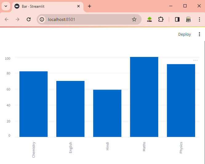
2. Bar Chart
A bar chart uses bars to show and compare different categories of data. To display a bar chart we use st.bar_chart().
Example:
import streamlit as st
import pandas as pd

# Sample data
data = {
    'Subject': ['Maths', 'Chemistry', 'Physics', 'Hindi', 'English'],
    'Marks Obtained': [100, 82, 91, 59, 70]
}

# Create a DataFrame
df = pd.DataFrame(data)

# Set the Subject column as the index
df.set_index('Subject', inplace=True)

# Plot the bar chart
st.bar_chart(df)
Working: This code creates a DataFrame with sample data representing subjects and their marks, sets the subject column as the index, and finally plots a bar chart.
Output:
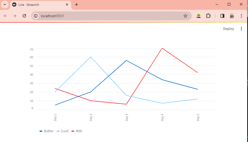
3. Line Chart
A line chart shows how data changes over time or categories using connected lines. To display a line chart we use st.line_chart().
Example:
import streamlit as st
import pandas as pd

# Sample data for Milk
data_milk = {
    'Days': ['Day 1', 'Day 2', 'Day 3', 'Day 4', 'Day 5'],
    'Milk': [24, 10, 6, 70, 42]
}

# Sample data for Curd
data_curd = {
    'Days': ['Day 1', 'Day 2', 'Day 3', 'Day 4', 'Day 5'],
    'Curd': [20, 60, 16, 7, 12]
}

# Sample data for Butter
data_butter = {
    'Days': ['Day 1', 'Day 2', 'Day 3', 'Day 4', 'Day 5'],
    'Butter': [5, 20, 56, 34, 23]
}

# Create DataFrames
df_milk = pd.DataFrame(data_milk).set_index('Days')
df_curd = pd.DataFrame(data_curd).set_index('Days')
df_butter = pd.DataFrame(data_butter).set_index('Days')

# Concatenate the DataFrames
df = pd.concat([df_milk, df_curd, df_butter], axis=1)

# Plot the area chart
st.line_chart(df)
Working: This code builds sample data for Milk, Curd, and Butter sales over five days, combines them into DataFrames, and then plots a line chart.
Output:
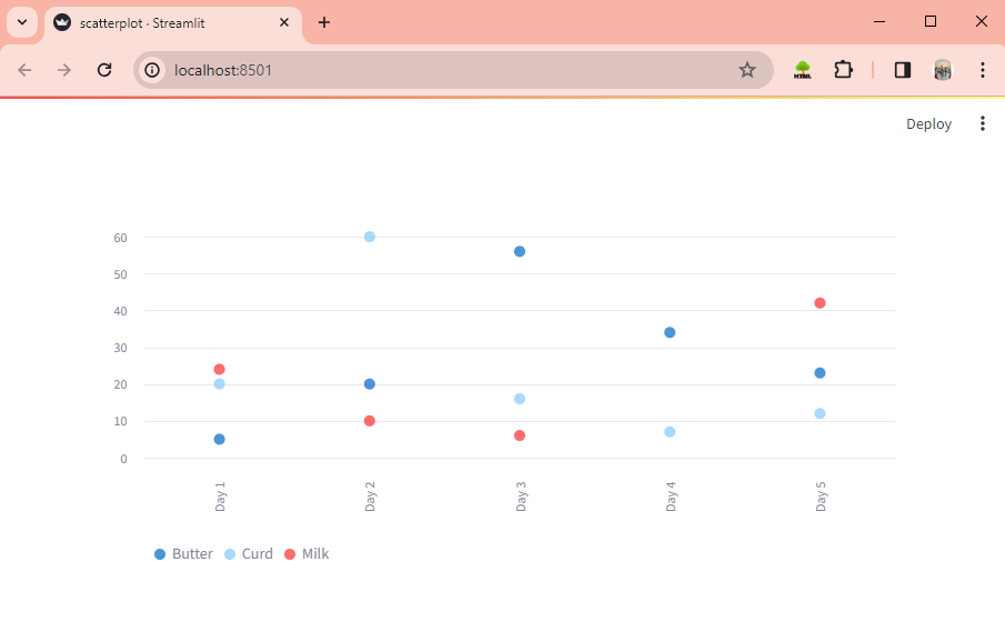
4. Scatterplot Chart
A scatterplot chart shows dots representing data points on a graph, helping to see how two variables relate to each other. The st.scatter_chart() helps us to display a scatterplot chart.
Example:
import streamlit as st
import pandas as pd

# Sample data for Milk
data_milk = {
    'Days': ['Day 1', 'Day 2', 'Day 3', 'Day 4', 'Day 5'],
    'Milk': [24, 10, 6, 70, 42]
}

# Sample data for Curd
data_curd = {
    'Days': ['Day 1', 'Day 2', 'Day 3', 'Day 4', 'Day 5'],
    'Curd': [20, 60, 16, 7, 12]
}

# Sample data for Butter
data_butter = {
    'Days': ['Day 1', 'Day 2', 'Day 3', 'Day 4', 'Day 5'],
    'Butter': [5, 20, 56, 34, 23]
}

# Create DataFrames
df_milk = pd.DataFrame(data_milk).set_index('Days')
df_curd = pd.DataFrame(data_curd).set_index('Days')
df_butter = pd.DataFrame(data_butter).set_index('Days')

# Concatenate the DataFrames
df = pd.concat([df_milk, df_curd, df_butter], axis=1)

# Plot the area chart
st.scatter_chart(df)
Working: The combined DataFrame is plotted on a scatterplot chart.
Output:
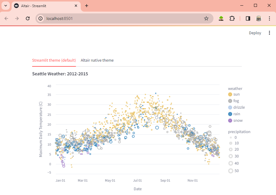
5. Altair Chart
Altair chart creates interactive visualizations from data using Python. The st.altair_chart() helps us to display a chart using the Altair library.
Example:
import altair as alt
import streamlit as st
from vega_datasets import data

source = data.seattle_weather()

scale = alt.Scale(
    domain=["sun", "fog", "drizzle", "rain", "snow"],
    range=["#e7ba52", "#a7a7a7", "#aec7e8", "#1f77b4", "#9467bd"],
)
color = alt.Color("weather:N", scale=scale)

brush = alt.selection_interval(encodings=["x"])
click = alt.selection_multi(encodings=["color"])


points = (
    alt.Chart()
    .mark_point()
    .encode(
        alt.X("monthdate(date):T", title="Date"),
        alt.Y(
            "temp_max:Q",
            title="Maximum Daily Temperature (C)",
            scale=alt.Scale(domain=[-5, 40]),
        ),
        color=alt.condition(brush, color, alt.value("lightgray")),
        size=alt.Size("precipitation:Q", scale=alt.Scale(range=[5, 200])),
    )
    .properties(width=550, height=300)
    .add_selection(brush)
    .transform_filter(click)
)

# Bottom panel is a bar chart of weather type
bars = (
    alt.Chart()
    .mark_bar()
    .encode(
        x="count()",
        y="weather:N",
        color=alt.condition(click, color, alt.value("lightgray")),
    )
    .transform_filter(brush)
    .properties(
        width=550,
    )
    .add_selection(click)
)

chart = alt.vconcat(points, bars, data=source, title="Seattle Weather: 2012-2015")

tab1, tab2 = st.tabs(["Streamlit theme (default)", "Altair native theme"])

with tab1:
    st.altair_chart(chart, theme="streamlit", use_container_width=True)
with tab2:
    st.altair_chart(chart, theme=None, use_container_width=True)
Working: This code creates interactive charts to show Seattle weather data using Altair. It displays a scatter plot and a bar chart in a Streamlit app with theme options.
Output:
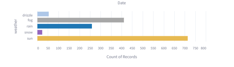
6. Flow Chart
A flowchart is a visual diagram that shows the steps of a process or algorithm using shapes and arrows. The st.graphviz_chart() helps us to achieve flow charts in it.
Example:
import streamlit as st

st.title("Food Web")
# Define the graph data
graph_data = """
digraph {
    Grass -> Grasshopper
    Grasshopper -> Frog
    Frog -> Eagle
    Grass -> Mouse
    Mouse -> Eagle
    Mouse -> Snake
    Grass -> Deer
    Deer -> Lion
    Lion -> Eagle
}
"""

# Display the graph using st.graphviz_chart
st.graphviz_chart(graph_data)
Working: This code creates a titled application called “Food Web“. It defines a graph using the Graphviz DOT language, representing a simple food chain, and then displays the graph using Streamlit’s graphviz_chart function.
Output:
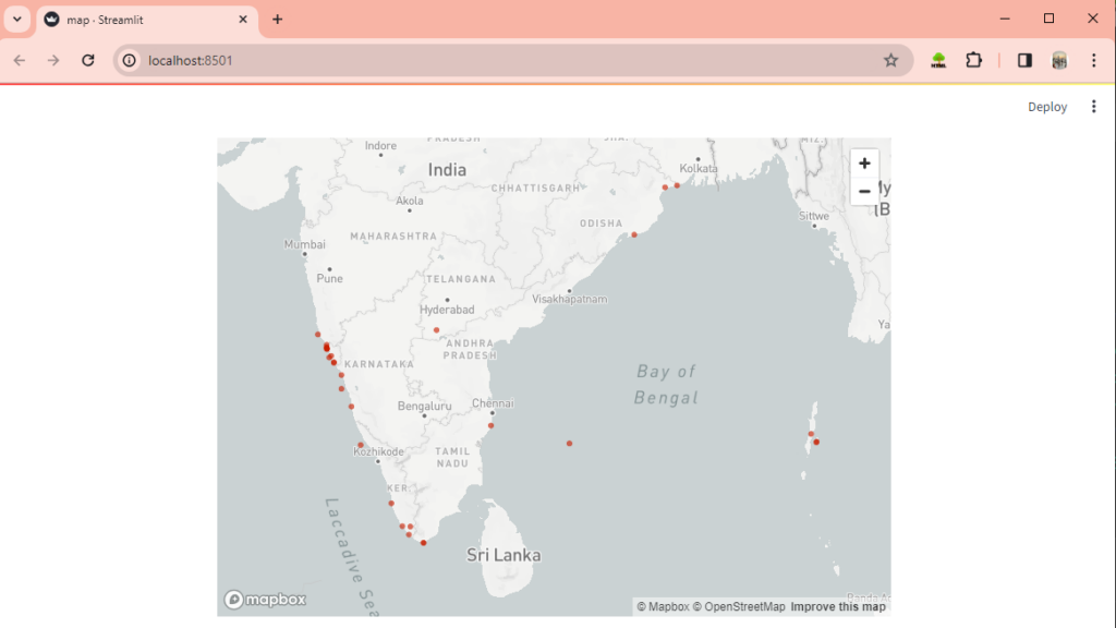
Visualizing Data Using Maps
Maps in data visualization show locations and spatial data using visual elements like points and lines. To display a map with a scatterplot overlaid on it, we use st.map().
Example:
import streamlit as st
import pandas as pd

# Sample data for beaches in India
data = {
    'Beach': ['Calangute Beach', 'Palolem Beach', 'Varkala Beach', 'Radhanagar Beach',
              'Baga Beach', 'Arambol Beach', 'Marari Beach', 'Kovalam Beach',
              'Anjuna Beach', 'Colva Beach', 'Digha Beach', 'Puri Beach', 'Chandipur Beach',
              'Muzhappilangad Beach', 'Kanyakumari Beach', 'Marina Beach', 'Varkala Beach',
              'Paradise Beach', 'Tarkarli Beach', 'Gokarna Beach', 'Agonda Beach', 'Mahabalipuram Beach',
              'Vagator Beach', 'Om Beach', 'Baga Beach', 'Varca Beach', 'Havelock Island Beach',
              'Elephanta Beach', 'Kochi Beach', 'Malpe Beach'],
    'LAT': [15.5433, 15.0105, 8.7317, 11.9982, 15.5445, 15.6903, 9.6194, 8.4021, 15.5841, 15.2744,
            21.6279, 19.8130, 21.5567, 11.8697, 8.0883, 8.0797, 8.7150, 11.9279, 16.2514, 16.0849,
            14.5481, 15.0364, 12.6169, 15.6048, 14.0210, 15.5350, 15.2125, 11.9697, 12.2940, 13.3456],
    'LON': [73.7550, 74.0231, 76.7164, 93.0060, 73.7478, 73.7397, 76.2855, 76.9757, 73.7413, 73.9182,
            87.5160, 85.8315, 87.0431, 75.0764, 77.5410, 77.5538, 77.0288, 83.2844, 78.0598, 73.3969,
            74.3197, 74.0247, 80.1986, 73.7403, 74.3218, 73.7437, 73.8408, 92.9907, 92.7866, 74.7154]
}
df = pd.DataFrame(data)

# Display the map centered around India
st.map(df)
Working: This code creates a DataFrame with data about beaches in India, including their names, latitude, and longitude. It then displays a map centered around India with markers representing these beaches using st.map().
Output-
Summary
We have come to the end of this chapter on data visualization. We hope you enjoyed it! We’ve explored different aspects of data visualization achievable using Streamlit, which offers various types of graphs and charts like line charts, flow charts, scatterplot charts, and more.
If you’re enjoying learning about Streamlit, be sure to check out other picks from this topic!
Reference