New to Rust? Grab our free Rust for Beginners eBook Get it free →
How to Implement the Flutter Scaffold Class?

Scaffold.of(context) looks upward for a Scaffold, so the context that creates one cannot find it. I was surprised that a Builder in this example can find ScaffoldMessenger but is still too high for Scaffold.of.
You’ll set the initial screen in MaterialApp’s home property and place its content in Scaffold’s body. You’ll see how Scaffold’s named slots fit that content into a Material screen layout.
What Is the Flutter Scaffold Class?
Scaffold is a Material Design layout widget for one screen. It gives named slots to the app bar, primary body, drawer, floating action button, and bottom navigation, then places those pieces around the available screen space.
A slot takes a widget, so the body can hold a Center, ListView, or another layout rather than a Scaffold-specific type. MaterialApp supplies the app-level Material environment.
- appBar accepts an AppBar for the screen title and actions.
- body holds the screen’s primary widget tree.
- drawer accepts a side navigation panel.
- floatingActionButton accepts one prominent screen action.
- bottomNavigationBar accepts persistent destination navigation.
Prerequisites for the Scaffold Example
You need the Flutter Software Development Kit (SDK) and a configured simulator, device, desktop, or web target to run the app. The example uses only Flutter’s Material library.
| Requirement | Why it is needed |
|---|---|
| Flutter SDK | Provides the framework and build tools. |
| Configured project target | Provides a simulator, device, desktop, or web destination for the app. |
| Material library import | Makes MaterialApp and Scaffold available to the Dart file. |
Step 1: Create the Material App Shell
MaterialApp provides the app-level Material context for its descendant widgets. The first screen goes in its home property, which Navigator opens as the initial route.
import 'package:flutter/material.dart';

void main() {
  runApp(const MyApp());
}

class MyApp extends StatelessWidget {
  const MyApp({super.key});

  @override
  Widget build(BuildContext context) {
    return MaterialApp(
      home: Scaffold(
        appBar: AppBar(title: const Text('Scaffold Demo')),
        body: const Center(child: Text('Screen content goes here')),
      ),
    );
  }
}
Its body accepts one widget, which can contain a larger tree for a list, form, or custom layout. Scaffold expands into the space its parent gives it.
Step 2: Add the AppBar, Body, Drawer, and Floating Action Button
Use this as the finished screen. The complete example below assigns each feature to a named Scaffold slot, so replace the smaller screen from Step 1 with it.
import 'package:flutter/material.dart';

void main() {
  runApp(const MyApp());
}

class MyApp extends StatelessWidget {
  const MyApp({super.key});

  @override
  Widget build(BuildContext context) {
    return MaterialApp(
      home: Builder(
        builder: (context) => Scaffold(
          appBar: AppBar(title: const Text('Scaffold Demo')),
          body: const SafeArea(
          child: Center(child: Text('Your screen content goes here')),
          ),
          drawer: Drawer(
          child: ListView(
            padding: EdgeInsets.zero,
            children: [
              const DrawerHeader(child: Text('Menu')),
              ListTile(
                leading: const Icon(Icons.home),
                title: const Text('Home'),
                onTap: () => Navigator.pop(context),
              ),
              ListTile(
                leading: const Icon(Icons.settings),
                title: const Text('Settings'),
                onTap: () => Navigator.pop(context),
              ),
            ],
          ),
          ),
          floatingActionButton: FloatingActionButton(
          onPressed: () {
            ScaffoldMessenger.of(context).showSnackBar(
              const SnackBar(content: Text('Action selected')),
            );
          },
          tooltip: 'Show action message',
          child: const Icon(Icons.add),
          ),
        ),
      ),
    );
  }
}
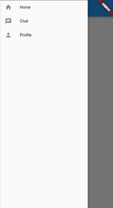
A ListView scrolls the menu, and each ListTile closes it through Navigator.pop, as Flutter’s Drawer documentation describes. Scaffold adds the AppBar menu button and opening gesture when you set drawer.
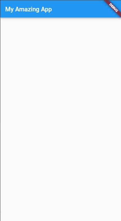
On a form, the default keeps focused fields visible. SafeArea keeps body content clear of system display cutouts, while Scaffold resizes it around the keyboard by default, as the Scaffold documentation describes.
Step 3: Connect the Floating Action Button to Feedback
The FloatingActionButton documentation recommends using it for the screen’s primary positive action rather than duplicating toolbar controls. Use an AppBar action for secondary commands.
| Code choice | Effect |
|---|---|
| onPressed: () { … } | Activates the button and runs its action. |
| onPressed: null | Disables the button, with no touch response. |
| ScaffoldMessenger.of(context).showSnackBar(…) | Shows transient feedback in the surrounding Scaffold. |
The Builder creates a context below MaterialApp’s ScaffoldMessenger but above the Scaffold it returns.
That placement lets the button find the messenger. A Scaffold.of lookup from the same context would still be too high.
Verify the Scaffold Screen
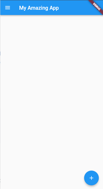
Run the app on a configured target. The AppBar should read “Scaffold Demo” and the body should read “Your screen content goes here.” Open the drawer to see Menu, Home, and Settings, then tap the + button and look for the “Action selected” SnackBar.
The existing screenshots above show the AppBar, open drawer, and floating action button, but they are reference images rather than a run of this code. Flutter and Dart are not installed in this environment, so I could not run the sample here. Check these labels and the SnackBar on your target before treating runtime behavior as verified.
| Screen area | Expected check |
|---|---|
| AppBar | Scaffold Demo |
| Body | Your screen content goes here |
| Drawer | Menu with Home and Settings entries |
| Floating action button | Action selected appears in a SnackBar |
When a Scaffold Lookup Has No Ancestor
Scaffold.of(context) searches upward from the supplied BuildContext for a Scaffold. A context used to create that Scaffold sits above it in the widget tree, so the lookup cannot find the widget it is building.
For a drawer button inside the screen, use a descendant context such as one supplied by Builder, or keep the drawer’s built-in AppBar menu button. For SnackBars, use ScaffoldMessenger.of(context), which manages those messages.
Builder(
  builder: (context) => IconButton(
    onPressed: () => Scaffold.of(context).openDrawer(),
    icon: const Icon(Icons.menu),
  ),
)
Put this Builder below Scaffold, such as inside its body, so its callback can find ScaffoldState. The built-in AppBar menu is simpler when the user only needs the standard drawer affordance.
Flutter’s Scaffold documentation describes the available slots and their behavior. The Flutter Drawer tutorial goes further into drawer content, and the Flutter TabBar tutorial covers tab-based navigation when that fits the screen better.
Keep One Scaffold Responsible for Each Screen
A Scaffold is the screen’s Material layout boundary, not a wrapper to add around every child widget. Start with one Scaffold for the route, place each screen-level feature in its slot, and add another only when the interface truly needs an independent nested screen.
- If the next task is building the menu itself, continue with the Flutter Drawer tutorial.
Flutter Scaffold Questions
What does Scaffold do in Flutter?
Scaffold provides the basic Material screen layout and slots for elements such as an app bar, body, drawer, floating action button, and bottom navigation.
Does a Flutter Scaffold need a body?
The body slot is optional. Add it when the screen has primary content, such as a Center, ListView, or form.
How do I show a SnackBar from a Scaffold?
Call ScaffoldMessenger.of(context).showSnackBar with a SnackBar. The supplied context must be below a ScaffoldMessenger, as it is in a screen built under MaterialApp.
Why does Scaffold.of(context) fail?
The BuildContext used to create a Scaffold is above that Scaffold, so an ancestor lookup from it cannot find the Scaffold being built. Use a descendant context or a suitable Builder.