
New to Rust? Grab our free Rust for Beginners eBook Get it free →
Plotting Smooth Curves in Matplotlib: 3 Effective Methods

Matplotlib is a widely used data visualization library in Python that allows us to work with data in the form of charts and graphs. Among the different types of charts and plots we can create with Matplotlib, it can be used to create plots with smooth curves. In this article, we’ll look at some ways in which we can achieve creating smooth curves in Python with Matplotlib, along with some examples for better visualization.
Methods of Plotting Smooth Curves Using Matplotlib
We may have encountered situations where we have way too many points between two points that lie close to each other and they may appear cluttered, that’s where smooth curves come into play. Smooth curves take a non-cluttered approach to visualizing scattered data points that lie extremely close to each other. However, in order to work with plots in Python we must first have the Matplotlib library installed in our system or in our project’s virtual environment.
Below is the command to install the Matplotlib library:
pip install matplotlib
To obtain smooth curves we will also require the help of other Python modules, besides Matplotlib. Each method that’s discussed below will require you to install different libraries.
Methods to create smooth curves with Matplotlib:
- Using NumPy library
- Using 1D Interpolation
- Using Spline Interpolation
Let’s look at each of these methods with examples.
1. Using NumPy Library
The simplest method to achieve smooth curves is to use the NumPy library. We can use to linespace() method in this library to generate data points between two given points which will ultimately help us plot our graph. After we have installed the NumPy library we can import it into our file or into our Jupyter notebook to start working with it.
We will look at how we can plot the graph of y=cos(x) using NumPy and Matplotlib.
Example:
import numpy as np
import matplotlib.pyplot as plt
import numpy as np
x = np.linspace(0, 6, 50)
y = np.cos(x)
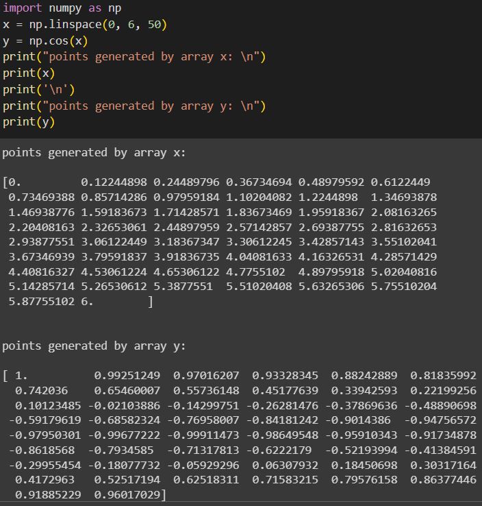
print("points generated by array x: \n")
print(x)
print("points generated by array y: \n")
print(y)
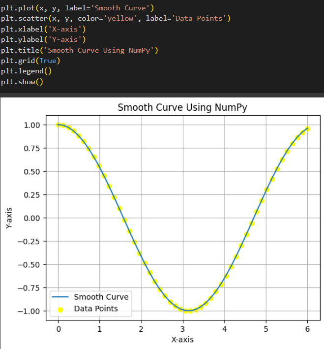
plt.plot(x, y, label='Smooth Curve')
plt.scatter(x, y, color='yellow', label='Data Points')
plt.xlabel('X-axis')
plt.ylabel('Y-axis')
plt.title('Smooth Curve Using NumPy')
plt.grid(True)
plt.legend()
plt.show()
In the example above, we have imported numpy as np and matplotlib.pyplot as plt. Then we use the linespace() method to generate 50 points between 0 and 6, which are all evenly spaced. This method returns an array of numbers that are equally spaced between the specified range. The array x will contain 50 points between 0 and 6.
Now we use the cos() function from numpy on each point in the x array, the cos(x) value of each point is then stored in the y array, thus generating a graph of the cos() function between the given points. Let us look at the values obtained by printing both arrays.
Output:
Now we can use matplotlib to visualize these points. Now we create two plots, one for the smooth curve and one showing the scattered data points. plt.plot() plots the smooth curve while plt.scatter() plots the 50 different points, the scattered points are given a yellow color. plt.xlabel() is used to set a label for the X axis and the same goes for plt.ylabel(). plt.title() is used to set a title for the graph and plt.legend() is used to give the description about what elements are used to denote what part of the graph.
Finally, we use plt.show() to display the graph.
Output (plot generated):
2. Using 1D Interpolation
SciPy is a library that is built on NumPy with additional features for more complicated tasks like signal processing. We use scipy.interpolate to create data points between our given data points. There are various ways in which we can create interpolation using SciPy, here, we’ll look at an example of interpolation using interp1d().
Example:
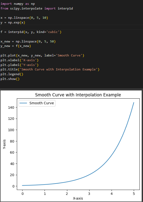
import numpy as np
from scipy.interpolate import interp1d

x = np.linspace(0, 5, 10)
y = np.exp(x)

f = interp1d(x, y, kind='cubic')

x_new = np.linspace(0, 5, 50)
y_new = f(x_new)

plt.plot(x_new, y_new, label='Smooth Curve')
plt.xlabel('X-axis')
plt.ylabel('Y-axis')
plt.title('Smooth Curve with Interpolation Example')
plt.legend()
plt.show()
The interp1d() function takes in two arrays of values x and y, where y is some function of x (y = f(x)). Then this method returns a new function that creates interpolation between the given points to generate new points, ultimately creating a smooth curve.
We use linespace() to generate an array of 10 points between 0 and 5. Now we use the y array to store the exponent value of each value in array x. We then use interp1d() to create interpolation between our initial x and y and store it in a function f. Here, kind=’cubic’ is used to signify that the curve generated should be smooth.
Now we use linespace() on x_new to generate an array of 50 points between 0 and 5. We then use the y_new array to store the values generated by calling the interpolation function f on each value in x_new.
The values of x_new and y_new are then used to generate a smooth curve, which is displayed using plt.show().
3. Using Spline Interpolation
Like the interp1d() method, SciPy also provides methods for spline interpolation such as splrep, which is used to represent the data points as a spline, and splev, used to generate more data points for a smooth curve. Here, we’ll look at an example of generating a smooth curve using the spline interpolation method.
Example:
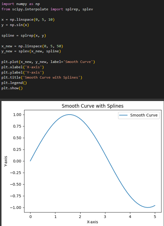
import numpy as np
from scipy.interpolate import splrep, splev

x = np.linspace(0, 5, 10)
y = np.sin(x)

spline = splrep(x, y)

x_new = np.linspace(0, 5, 50)
y_new = splev(x_new, spline)

plt.plot(x_new, y_new, label='Smooth Curve')
plt.xlabel('X-axis')
plt.ylabel('Y-axis')
plt.title('Smooth Curve with Splines')
plt.legend()
plt.show()
This code works similarly to the interp1d() method with some slight differences. We use linespace() to generate 10 points between 0 and 5, initially. Then we use array y to generate sin(x) for each value in array x. We then use the splrep() method on arrays x and y to represent it as a spline curve.
Then we use linespace() on x_new to generate 50 points between 0 and 5. Using splev() on y generates an array of new data points which will give a smoother curve. This plot is then displayed using plt.show().
Output:
To visualize the data points generated along with the smooth curve, we can use plt.scatter() (as shown in the first example)
Conclusion
Matplotlib is a powerful tool that can help us visualize all kinds of data. In cases where we have many data points that are closely spaced, Matplotlib provides us with various methods using different Python libraries to neatly visualize them as a smooth curve, rather than clustering all the points. Some of the methods that we have discussed that help us to create smooth curves are: Using the NumPy module for smooth curve generation and using various methods provided by the SciPy library such as interp1d(), splrep() and splev().
Reference
https://stackoverflow.com/questions/5283649/plot-smooth-line-with-pyplot