
New to Rust? Grab our free Rust for Beginners eBook Get it free →
Online PX to REM Converter – Turn Pixels into Scalable, Accessible CSS


When a design gives you a size in pixels but your stylesheet uses rem, you need the equivalent value for the page’s root font size. The online px to rem converter divides the pixel value by that root font size and returns the rem value.
This article explains the conversion formula and shows how to use the converter and check its result in your stylesheet.
TL;DR: Convert px to rem with one division
Divide the pixel value by the font size computed on the page’s root element. With a 16px root size, 24px becomes 1.5rem, because 24 ÷ 16 = 1.5.
- Formula: rem = px ÷ root font size in px.
- Use the root size that applies to the CSS you are writing, not an assumed default.
- The converter returns the number with a rem unit. it does not decide whether rem is right for that property.
What is a px to rem conversion?
A px to rem conversion expresses the same CSS length using the root-relative rem unit instead of px. In an HTML document, rem is based on the computed font size of the root element, usually html. The number therefore depends on that root size.
At a 16px root size, 1rem represents 16 CSS pixels. A 24px value divided by 16 becomes 1.5rem. At a 20px root size, 24px becomes 1.2rem, so the ratio depends on the reference size.
CSS px is a reference unit, not a physical screen-pixel guarantee. The conversion is arithmetic, not an accessibility fix. CSS rules, browser settings, zoom and the sized property all affect the result visitors see.
| Pixel value | Root size | Equivalent rem |
|---|---|---|
| 16px | 16px | 1rem |
| 24px | 16px | 1.5rem |
| 24px | 20px | 1.2rem |
| 32px | 16px | 2rem |
What should you know before converting?
The important input is the root element’s computed font size for the page or component where the value will be used. A 16px size is common, but a stylesheet can change it. Browser text preferences can also affect the initial value when the stylesheet leaves it at the browser default.
Use these checks before entering a base value:
- Find the root-size rule in the project’s base styles.
- Inspect the computed root font size in developer tools if the stylesheet is unclear.
- Confirm the target CSS property should use a root-relative unit.
For a 10px root size, enter 10 as the base and 24px converts to 2.4rem, not 1.5rem. The “62.5%” technique is one reason projects may use a 10px reference. Verify the setting instead of inferring it from convention.
A 16px root size is common because browsers often use it as the initial font size, but rem is not permanently equal to 16px. When CSS sets a different root font size, rem follows the computed value for that root. If styles are scoped or the document changes between projects, confirm which page-level root applies before converting.
Rem follows the root size, while em follows the element’s font-size context and can scale with component text. Choose the unit that fits the target property. The converter cannot make that design decision.
How to use the online px to rem converter
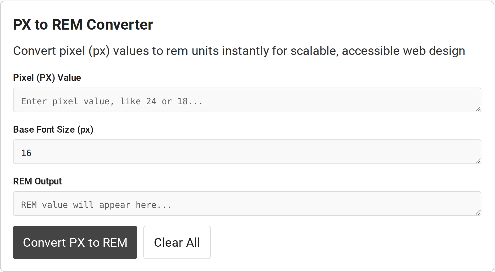
The converter has a pixel-value field, a base-font-size field, a result field, and controls to convert or clear the values. The displayed default base is 16. replace it when the target stylesheet uses another root size.
Step 1: Choose the root font size
Read the root size from the project’s CSS or computed styles. Enter that number in pixels in Base Font Size. If the project intentionally keeps the browser’s initial root size, 16 is a common assumption, but verify the actual page instead of treating it as a rule.
Step 2: Enter the pixel measurement
Type the numeric pixel amount in Pixel (PX) Value. Enter the number, such as 24, rather than the CSS suffix px. Keep the value and base size in the same unit so the division produces a unitless ratio.
Step 3: Convert and check the result
Select Convert PX to REM and read REM Output. For 24 with a base of 16, check the arithmetic independently: 24 ÷ 16 = 1.5, so the CSS length is 1.5rem. The result should change if you change the base size, because rem is relative to that size.
Step 4: Use the rem value in the stylesheet
Copy the numeric result and append rem where the CSS property expects a length. For example, a computed result of 1.5 becomes the value 1.5rem. Review the rule in context: a font size, margin, padding, and width can all accept CSS lengths, but a conversion cannot determine whether the chosen size is appropriate for the design.
Use Clear All before a new calculation if you want to reset both entries. The base-size field returns to 16, so check it again before converting another project’s measurement.
What can change or invalidate the result?
The calculation only represents the intended CSS length when the entered base matches the root size that applies to the page. Input handling and displayed precision can also affect what the converter accepts or shows.
| Case | What to check | How to respond |
|---|---|---|
| Root size differs from 16px | Computed font size on the root element | Use that value as the base and recalculate. |
| Base size is zero or invalid | A division by zero has no finite result. the page tool reports an input error for a zero base. | Enter a positive, valid root size. |
| Decimal pixel value | Fractions are valid CSS length amounts in many properties. | Keep enough precision for the design. do not round prematurely. |
| Negative value | CSS properties differ on whether negative lengths are allowed. | Check the target property before using a negative result. |
| Rem output looks rounded | Displayed decimal places may not show the full ratio. | Use the exact division or retain more digits where needed. |
| Expected accessibility improvement | Changing px to rem alone does not guarantee accessible text or layout. | Test browser text resizing, zoom, wrapping and contrast in the actual interface. |
Do not treat parseable input as CSS validation. A negative value is invalid for some properties, including padding. Check the target property and inspect the rendered result.
When an interface reports an error, verify the invalid field before copying a previous result. A zero or blank base has no meaningful ratio, and nonnumeric input needs correction. Then convert again and compare the answer with px divided by the chosen root size.
Rounding is a display choice, not a change to the formula. If the exact quotient is a repeating decimal, a short value such as 0.67rem is an approximation. Keep additional decimal places when the conversion must preserve precision, or choose a design-system token instead of carrying long decimal values through the stylesheet.
Rem can follow root-size changes, but accessibility depends on more than the unit. A fixed root font-size can override browser defaults, while constrained containers can clip enlarged text. Check the page at increased text size and browser zoom.
Common errors with the px to rem converter
The converter accepts numeric text, but a returned number is useful only when both inputs match the CSS you are changing. Check these input and CSS-property cases before copying the result.
- Entering a zero base: the calculation divides by the base size, so zero cannot produce a finite rem value. Enter the page’s positive computed root size.
- Typing a unit suffix: enter the number in the field, such as 24, rather than 24px. The converter parses numeric input and appends rem to its result.
- Using a negative result for every property: CSS properties have different length rules. Padding does not accept negative lengths, so check the property before applying a negative value.
- Rounding a repeating quotient: a short decimal is an approximation. Keep additional digits if the exact ratio matters.
If the output looks wrong, divide the pixel input by the root size you verified in computed styles. Then test the resulting rem value in the target property and check the rendered layout at browser zoom and increased text size.
Conclusion: Match the rem value to the CSS root size
A px-to-rem converter answers one specific question: what number of root-relative units equals this pixel length at the chosen root size? Confirm that size in the page’s computed styles, divide px by that base, then check the result in the property where it will be used.
For the unit definition and related CSS length behavior, see MDN’s guide to CSS values and units and its CSS length reference. To reverse the calculation, use the online REM to PX converter.
How do I convert px to rem?
Divide the pixel value by the root element’s font size in pixels. For example, 24px divided by a 16px root size equals 1.5rem.
What base font size should I use?
Use the computed font size of the root element for the page where the CSS will run. Sixteen pixels is common, but a stylesheet or browser preference can change it.
Can I convert decimal pixel values?
Yes. Divide the decimal pixel value by the root size in pixels, then keep enough decimal places for the required precision.
What happens if the base font size is zero?
Division by zero has no finite result. Enter a positive, valid root font size before converting.
Is rem more accessible than px?
Rem can follow changes to the root font size, but changing units alone does not guarantee accessibility. Test text resizing, zoom and layout behavior on the finished page.
What is the difference between rem and em?
Rem is based on the root element’s computed font size. Em is based on the relevant element’s font size context, so nested em values can depend on their parent.