
New to Rust? Grab our free Rust for Beginners eBook Get it free →
What is D3.js? A complete guide to the D3 JS visualization library

D3.js (or D3 JS) is a JavaScript library for building custom data visualizations directly in the browser using SVG, HTML and CSS. Mike Bostock created it in 2011. It now powers everything from newsroom graphics to internal dashboards. Unlike chart libraries that hand you ready-made bar charts, D3 gives you low-level building blocks and lets you wire them together yourself. This guide covers what D3.js actually is, how it compares to simpler charting tools and how to build your first chart with it.
What is D3.js
D3.js stands for Data-Driven Documents. It’s an open-source JavaScript library for visualizing data, built on web standards instead of a proprietary rendering engine.
Here’s the part that trips people up: D3 has no concept of a “chart.” You won’t find a barChart() function anywhere in the library. Instead, D3 gives you primitives: selections, scales, shapes, axes and data joins. You compose them into whatever visual you need.
That’s a deliberate trade. A basic chart might take a few dozen lines of code in D3, where a dedicated charting library would do it in three. In exchange, you get complete control over every pixel, which matters once your visualization needs to do something a template can’t.
A brief history of D3.js
Mike Bostock built D3 in 2011 while at Stanford, working with Jeff Heer and Vadim Ogievetsky on what became the original D3 research paper. Jason Davies contributed heavily to D3’s geographic projection system between 2011 and 2013. Philippe Rivière has maintained the library and its documentation since 2016.
D3 is now maintained by the team at Observable, the platform Bostock co-founded for collaborative data analysis. The library sits at version 7.9.0 and bundles more than 30 individual modules under one package. Its GitHub repository has crossed 113,000 stars with over 480,000 projects depending on it directly. That kind of adoption is rare for a library this specialized.
When to use D3?
D3.js works well for bar graphs, pie charts and far more advanced visuals. It’s a heavy library though. If you only need a couple of simple charts, a lighter library will get you there faster.
Where D3 earns its weight is heavy-lifting work: custom, data-dense visuals that off-the-shelf charting tools can’t produce. This tutorial starts with a few small projects so you can see the core mechanics before attempting something bigger.
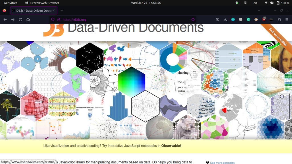 Check out the official site of D3
To see the scale we’re talking about, check out the official D3.js website. Each hexagon on the homepage links to a community project built with D3. Scrolling through them is the fastest way to understand what the library can actually do.
The official documentation is worth bookmarking as a reference too. The examples gallery on the same site is a great source of inspiration whenever you’re stuck on how to structure your own chart.
D3.js vs other charting libraries
If you’ve used Chart.js or Highcharts before, D3 will feel different from the first line of code. Those libraries hand you a ready-made bar() or pie() function. D3 hands you the raw materials and expects you to build the chart yourself.
That difference shows up fast. A histogram in Chart.js is a config object. The same histogram in D3, or its higher-level sibling Observable Plot, can take 50 lines because you’re deciding how every axis, scale and shape behaves.
Here’s the same three-bar chart in both. Chart.js needs a config object:
new Chart(ctx, {
  type: 'bar',
  data: {
    labels: ['A', 'B', 'C'],
    datasets: [{ data: [10, 20, 30] }]
  }
});
D3 needs you to build it from primitives:
d3.select('svg')
  .selectAll('rect')
  .data([10, 20, 30])
  .enter()
  .append('rect')
  .attr('x', (d, i) => i * 40)
  .attr('y', d => 100 - d)
  .attr('width', 30)
  .attr('height', d => d)
  .attr('fill', 'steelblue');
Both render three bars. Only one of them lets you later turn each bar into a draggable, animated, custom-shaped element without fighting a config schema.
| Library | Learning curve | Customization | Best for |
|---|---|---|---|
| Chart.js | Low | Presets only | Quick dashboards |
| Observable Plot | Medium | High-level but flexible | Fast exploratory charts |
| D3.js | Steep | Near total | Custom, interactive graphics |
If you need a chart today and the defaults are close enough, reach for Chart.js. If you need full control over an interactive, animated, one-of-a-kind visualization, D3 is the tool built for exactly that job.
Core features of D3.js
A few features set D3 apart from other visualization tools:
- Data-driven DOM manipulation: D3 binds data straight to HTML and SVG elements, so a change in your data can directly drive a change on screen.
- Scale functions: built-in linear, time, ordinal and log scales map raw data values to pixels, colors or sizes.
- Data loading and parsing: d3-fetch and d3-dsv handle CSV, JSON and TSV formats without extra dependencies.
- Layout algorithms: treemaps, force-directed graphs, hierarchies and Voronoi diagrams come built in.
- Transitions: smooth, interruptible animations between data states, with control over easing, delay and duration.
- Interaction helpers: drag, zoom, pan and brush behaviors that would otherwise take real effort to build from scratch.
Each of these ships as a separate module, so you only load what your project actually needs.
Core D3.js modules you should know
D3 bundles more than 30 modules under one package, but you’ll lean on a handful of them in almost every project.
Selections and data joins
d3-selection is how you grab and modify DOM elements. Chained calls like .attr() and .style() read almost like plain English. d3-transition builds on top of it for animated state changes.
d3.select('.chart').style('background', '#f5f5f5');
Scales and axes
d3-scale converts data values into pixels, colors or sizes. d3-axis then renders that scale visually, so viewers can read the encoding instead of guessing at it.
const y = d3.scaleLinear().domain([0, 100]).range([300, 0]);
Shapes and layouts
d3-shape draws arcs, lines, areas and pie slices as SVG paths. d3-hierarchy adds layout algorithms for trees, treemaps and packed circles on top of that.
const line = d3.line().x(d => x(d.date)).y(d => y(d.value));
Data helpers
d3-array, d3-fetch and d3-dsv cover statistics, remote data loading and CSV or TSV parsing, everything your data needs before it touches the DOM.
const max = d3.max(dataset, d => d.value);
Interaction
d3-drag, d3-zoom and d3-brush give you dragging, zooming and selection behavior without hand-rolling mouse event math yourself. They’re the modules that turn a static chart into something a viewer can actually click through and manipulate.
d3.select('svg').call(d3.zoom().on('zoom', (event) => {
  g.attr('transform', event.transform);
}));
Installing D3.js in your project
There are two common ways to get D3 into a project. Which one you pick depends on whether you’re prototyping or shipping something long-term.
Using a CDN script tag
For quick prototypes, a single script tag is enough:
<script src="https://d3js.org/d3.v7.min.js"></script>
This pulls the full D3 bundle from the CDN, no build step required. It’s the fastest way to get a chart on screen. It’s exactly what the walkthrough later in this article uses.
Installing via npm
For anything you plan to maintain, install D3 as a proper npm dependency:
npm install d3
Then import only the pieces you need instead of the whole bundle:
import { select, scaleLinear, csv } from "d3";
Importing individual functions keeps your bundle size down. This matters if you’re using a bundler like Vite or webpack that tree-shakes unused code.
Coding your own D3 project
This walkthrough builds a small D3 project step by step, from an empty HTML file up to a working bar chart.
Setting up the HTML skeleton
Start with an empty HTML file and pull in the D3 source. Add this script tag:
<script src="https://d3js.org/d3.v7.min.js"></script>
This walkthrough uses VS Code with the Live-Server extension as the editor. Type ! and hit Tab to generate the HTML skeleton, then add the script tag above. Add an h2 tag and preview it in the browser.
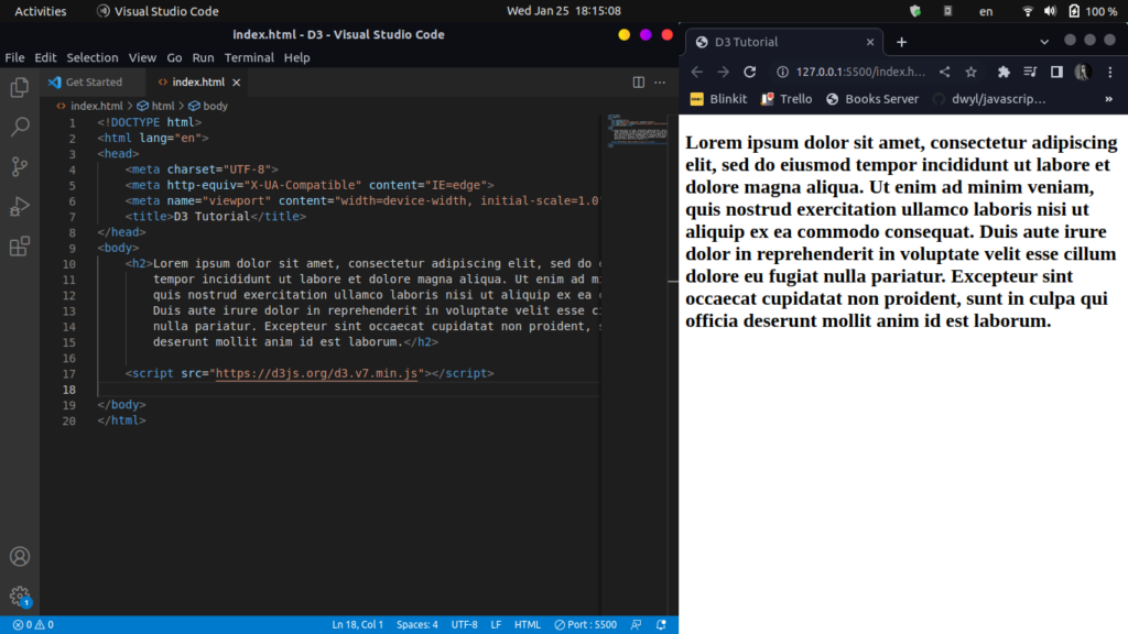 Getting an h2 tag and some dummy text
Selecting and styling an element
D3 can now target that h2 tag. Add a second script tag for the D3 code. This snippet selects the h2 and bumps its font size to 50px:
<script>
    d3.select('h2').style('font-size', '50px');
</script>
Refresh the browser and the heading text is noticeably larger.
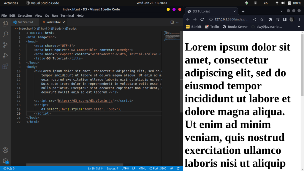 Select the h2 tag and increase its font-size
Binding array data to a list
Next, add an empty ul element below the h2 tag. Inside the script tag, define an array of plant names, then select the ul (and each li inside it) to populate it with that data:
<ul></ul>
<script src="https://d3js.org/d3.v7.min.js"></script>
<script>
plants = ["jade-plant", "peace-lily", "snake-plant", "dahlia"]
d3.select('ul').selectAll('li').data(plants).enter().append('li').text(plants => plants);
</script>
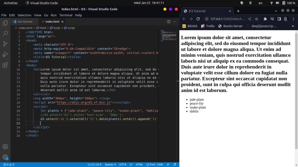 Selecting an Unordered List and populating it with data
Building a bar chart with SVG
For a real feel of how D3 works, build a simple bar chart. Start with an empty SVG element, then set up a dummy dataset, dimensions and optional padding. Divide the SVG width by the number of data points to get each bar’s width, then select the SVG and set its width and height:
<svg></svg>
    <script src="https://d3js.org/d3.v7.min.js"></script>
<script>
let dataset = [10, 20, 30, 90, 46, 28, 68, 32, 87];
        let svgWidth = 300, svgHeight = 300;
        let pad = 5;

        let barWidth = (svgWidth / dataset.length);

        var svg = d3.select('svg').attr("width", svgWidth).attr("height", svgHeight);

        var barChart = svg.selectAll("rect")
                          .data(dataset)
                          .enter()
                          .append("rect")
                          .attr("y", function(d) {
                            return svgHeight - d
                          })
                          .attr("height", function(d) {
                            return d;
                          })
                          .attr("width", barWidth - pad)
                          .attr("transform", function(d, i) {
                            var translate = [barWidth * i, 0];
                            return "translate("+ translate +")";
                          });
</script>
Bars are just rectangles, so the code selects all rect elements inside the SVG. Since none exist yet, that selection starts empty. Calling data() and enter() walks through each item in the dataset and appends a rectangle for it.
Each rectangle gets a y, height and width, plus a transform. The y attribute matters most since it stops the bars from piling on top of each other. It takes svgHeight and subtracts the data value. Height simply returns the raw data point.
Width comes from the bar width calculated earlier minus the padding. Finally, the transform shifts each bar sideways using translate() so the bars sit side by side instead of stacking. Here’s the result:
 Creating a Bar-chart in D3
Loading and binding external data with D3
Dummy arrays are fine for learning, but real projects pull data from a file or an API. D3 ships d3-fetch specifically for this. It returns a promise you can await like any other fetch call.
To load a CSV file:
d3.csv("data.csv").then(function(data) {
  console.log(data);
});
There’s a catch worth knowing upfront. Every value D3 reads from a CSV or JSON object arrives as a string, even the numbers. Convert them before using them in a scale or a calculation:
d3.csv("data.csv").then(function(data) {
  data.forEach(function(d) {
    d.value = +d.value;
  });
  console.log(data);
});
The unary plus operator above is the fastest way to force a string into a number. For JSON data, swap d3.csv for d3.json and the same pattern applies.
Building a scatter plot with D3.js
A bar chart shows one kind of encoding. A scatter plot is a good second project because it forces you to work with two scales at once, one for each axis.
Here’s a minimal scatter plot using random data points:
const width = 400, height = 300, margin = 40;

const svg = d3.select("body")
  .append("svg")
  .attr("width", width)
  .attr("height", height);

const data = Array.from({ length: 50 }, () => [
  Math.random() * (width - margin * 2),
  Math.random() * (height - margin * 2)
]);

svg.selectAll("circle")
  .data(data)
  .enter()
  .append("circle")
  .attr("cx", d => d[0] + margin)
  .attr("cy", d => d[1] + margin)
  .attr("r", 4)
  .style("fill", "steelblue");
The pattern should look familiar by now: select a container, bind data with .data(), then use .enter() and .append() to create one circle per data point. Swap the random values for real coordinates and axes. This same structure scales up to production dashboards.
Add an x and y scale mapped to real domains instead of raw pixel values. This same handful of lines becomes an actual analytical chart rather than a random dot cloud:
const x = d3.scaleLinear().domain([0, 100]).range([margin, width - margin]);
const y = d3.scaleLinear().domain([0, 100]).range([height - margin, margin]);

svg.append('g')
  .attr('transform', `translate(0, ${height - margin})`)
  .call(d3.axisBottom(x));

svg.append('g')
  .attr('transform', `translate(${margin}, 0)`)
  .call(d3.axisLeft(y));
Swap the cx and cy attributes on the circles above to use x(d.value1) and y(d.value2) instead of raw pixel math. The chart now reads real data on a labeled grid.
Adding transitions and animations
Static charts are useful, but D3’s real strength shows up in transitions. A transition interpolates between two states over time instead of jumping straight to the new value.
svg.selectAll("circle")
  .data(newData)
  .transition()
  .duration(750)
  .attr("cy", d => yScale(d.value))
  .style("fill", "orange");
The transition() call above tells D3 to animate the change over 750 milliseconds instead of applying it instantly. You can also chain .delay() to stagger multiple elements and .ease() to control the acceleration curve. Elements can start slow and speed up, or bounce, based on the ease function you pick.
This is also where D3’s data join concept, entering, updating and exiting elements as separate operations, actually pays off. You get precise control over what animates in, what animates out and what just updates in place.
A common pattern is toggling between two datasets on a click, with D3 handling the animation between them automatically:
let showingA = true;

d3.select('button').on('click', () => {
  const nextData = showingA ? datasetB : datasetA;
  svg.selectAll('circle')
    .data(nextData)
    .transition()
    .duration(600)
    .attr('cy', d => y(d.value));
  showingA = !showingA;
});
Every circle animates to its new position on its own, with no manual frame-by-frame math required.
Practical use cases for D3.js
D3 shows up most often in three kinds of projects: interactive dashboards, journalism-style data stories and network or geospatial visualizations. The New York Times used D3 for its 2012 “512 Paths to the White House” piece, a visualization often cited as proof of what the library can do at scale.
Beyond news graphics, D3 powers internal analytics tools, geographic maps built with d3-geo and network diagrams that use d3-force to lay out nodes and connections automatically. Anywhere a team needs a visualization that doesn’t exist as an off-the-shelf chart type, D3 tends to be the tool people reach for.
Teams building internal tools also reach for D3 when a stakeholder asks for something a dashboard library can’t quite render, a custom timeline, an unusual map projection or a chart type nobody has built a plugin for yet.
Advantages and limitations of D3.js
Advantages
D3 works with any JavaScript framework, since it’s a library rather than a framework itself. It’s open source under the ISC license, backed by a large community and gives you complete control over customization since there’s no default chart style to fight against.
Limitations
That control comes at a cost. D3 has a steep learning curve compared to preset charting tools. It doesn’t handle accessibility or responsive behavior automatically. Older browsers can also struggle with D3’s heavier, more complex visualizations.
Frequently asked questions
What is D3.js used for?
D3.js builds custom, interactive data visualizations directly in the browser, including bar charts, network graphs, geographic maps and dashboards, using SVG, HTML and CSS instead of a proprietary renderer.
Is D3.js a library or a framework?
D3.js is a JavaScript library, not a framework. It works alongside any framework you already use, including React, Vue and Svelte, without imposing its own project structure.
Do I need advanced JavaScript to learn D3.js?
You need solid JavaScript basics, including arrays, functions and callbacks, plus basic SVG knowledge. D3’s syntax is approachable, but its concepts like data joins take practice to fully click.
What is the latest version of D3.js?
D3.js is currently at version 7.9.0, released in March 2024. It bundles more than 30 individual modules together for convenience, though each module can also be installed separately.
Is D3.js free to use?
Yes, D3.js is completely free and open source, released under the ISC license. You can use it in personal or commercial projects without any licensing fees or restrictions.
How is D3.js different from Chart.js?
Chart.js gives you ready-made chart types with simple configuration. D3.js gives you low-level building blocks instead, so it takes more code but supports fully custom, one-of-a-kind visualizations.
Can D3.js work with React or Vue?
Yes, D3 pairs well with React, Vue and Svelte. A common pattern lets D3 handle calculations like scales while the framework manages rendering and DOM updates.